Shopping Cart
There are no more items in your cart

- -20%
So get ready to see it on social networks, in fashion shop windows and in furniture magazines; this is because every year the PANTONE COLOR OF THE YEAR influences fashion, beauty and design, as well as products such as packaging and graphics.
Pantone has become a global authority, a role it has conquered since the first "Colour of the year" launch in 2000. Begun as a marketing strategy, the search for color was transformed into the Pantone Color Institute with a team of 20 people dedicated to this task. The color of the year, they explain, is "a color snapshot of what we see happening in our global culture. Colour serves as an expression of a state of mind and a global attitude." Experts search the world for new colour influences: they study the entertainment and film industries, new art collections, fashion, design trends, the most popular tourist destinations, as well as lifestyles and society. Everything that influences the modern world is taken into account by the Pantone Color Institute, chaired by Leatrice Eiseman.
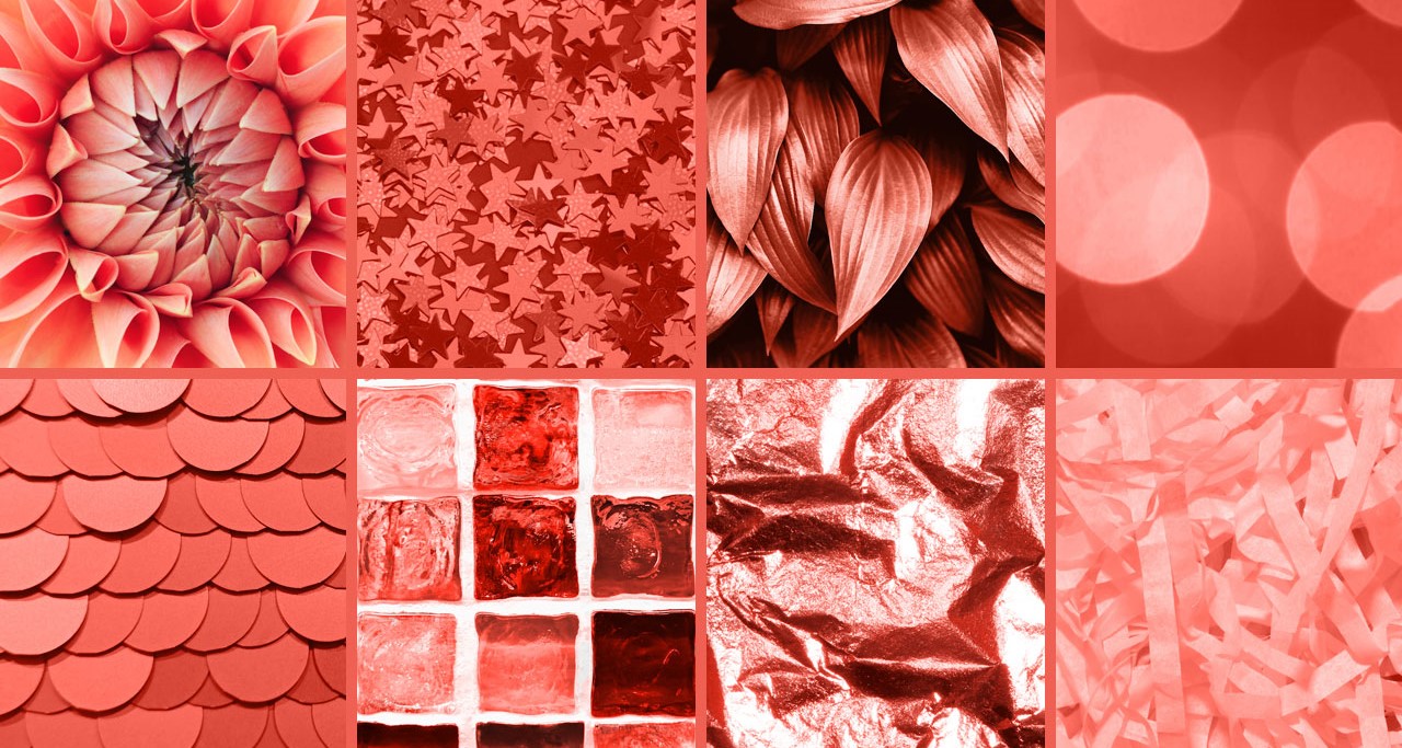
"This colour helps us to remember a very delicate moment for the environment, so it protects the varied kaleidoscope of colours of coral reefs" explained Laurie Pressman, vice president of Pantone. This colour makes us reflect, but at the same time envelops us in warmth and affection, infusing comfort and optimism into a changing world. "A coral tone full of vitality with a hint of gold that infuses energy and gently revives."
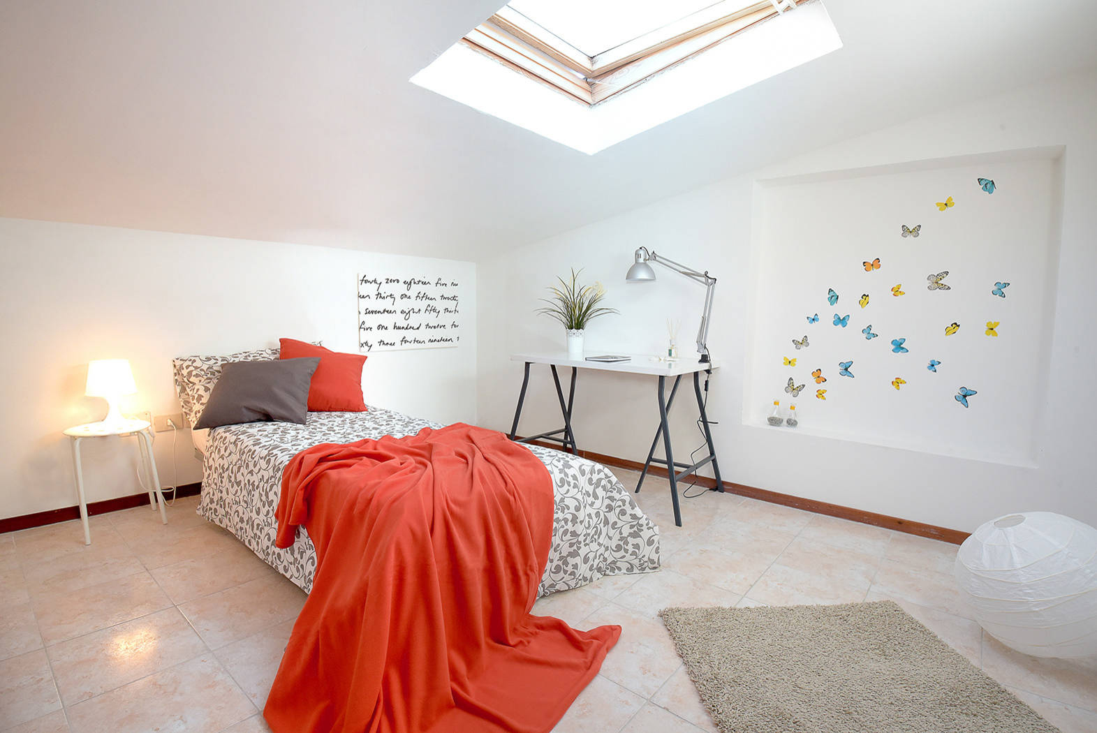
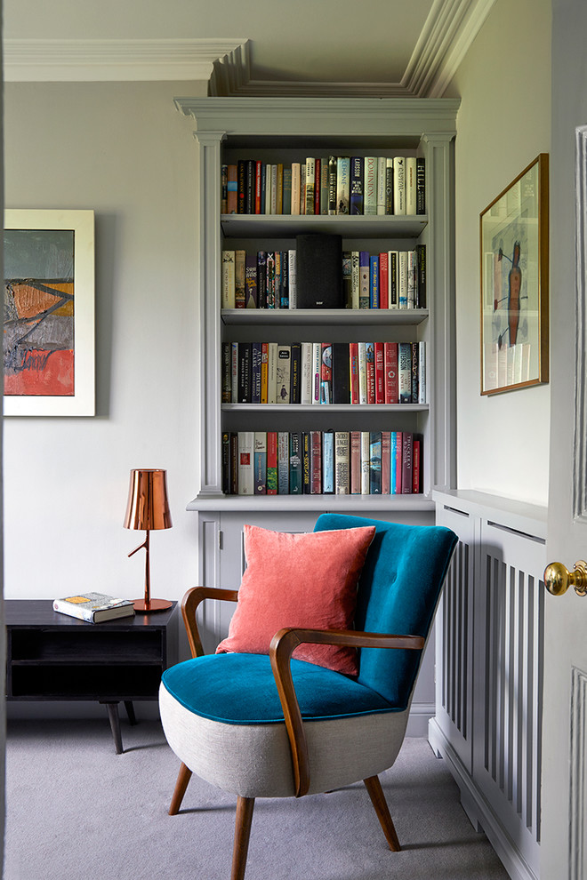
Living Coral is an intense, bright, very charged colour. The easiest and most immediate way to get environments into the mood is to choose details in this shade, such as cushions, vases, accessories, textiles, dishes or design objects. It is perfect for bringing out original details, given in calibrated doses; even better if in a matt or not very shiny finish, softer and more sophisticated, which will be particularly enhanced by a warm light. But how can we use Living Coral in furniture? Living Coral is an intense, bright, very charged colour. The easiest and most immediate way to get environments into the mood is to choose details in this shade, such as cushions, vases, accessories, textiles, dishes or design objects. It is perfect for bringing out original details, given in calibrated doses; even better if in a matt or not very shiny finish, softer and more sophisticated, which will be particularly enhanced by a warm light.
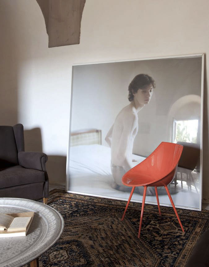
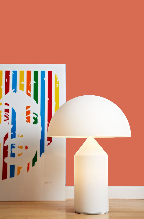
On the other hand, if you are particularly in love with this colour and want to dare more, you can choose it for furniture or walls. In this case, however, you should pay attention to how you combine it: Living Coral goes with soft colors such as cream, gray, beige and rope. In addition, to enhance it at its best, this color matches perfectly with the colors of the sea, so you can indulge in turquoise, blue and water green.